Rebranding, brand strategy, brand architecture, brand design, visual identity
Co-Creation

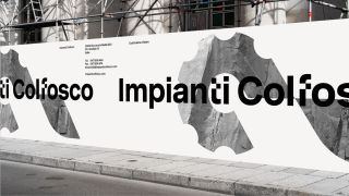
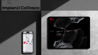
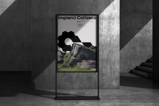
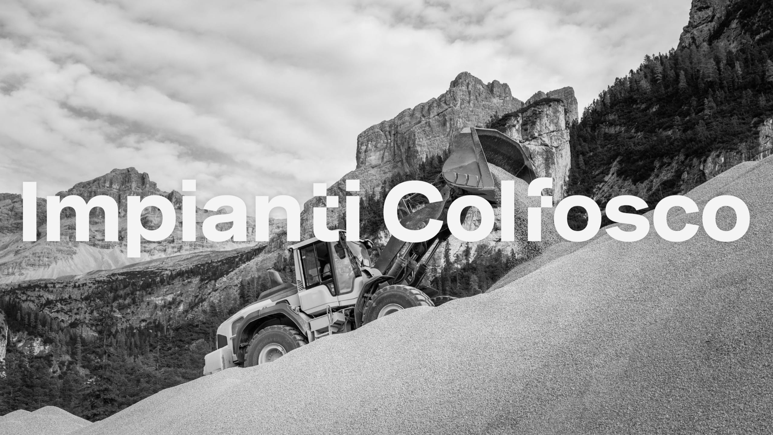
Impianti Colfosco: defining a shared vision for the future

For Impianti Colfosco, a company with over 100 employees, we developed a series of strategic workshops engaging representatives from all divisions, ownership, and management. This collaborative approach gathered diverse perspectives on key topics like future goals and cultivating a strong sense of belonging within a people-centered company.
This blend of perspectives shaped a unified corporate vision that reinforces the company’s bond with the local community and drives its commitment to well-being, sustainability, and shared growth.

Rebranding, brand strategy, brand architecture, brand design, visual identity
Brand Strategy

Through a collaborative workshop process with the Impianti Colfosco team, we shaped a clearer, more purposeful brand identity aligned with the company’s core values.

Among the key outcomes was the reorganization of the brand architecture, which had previously been fragmented. The decision to retain the Impianti Colfosco name as a strong identifier - closely tied to the technical and production divisions - helped reinforce consistency, foster a sense of belonging, and drives ongoing improvement, all while honoring the company’s roots.

To complement this, the byline "Costruiamo valore" was introduced, capturing the company’s commitment to the local community across both winter and summer seasons.

Rebranding, brand strategy, brand architecture, brand design, visual identity
Brand Strategy

The new visual identity of Impianti Colfosco modernizes the brand’s most iconic historic elements to ensure continuity, clarity, and cohesion. The updated logo refines the original’s distinctive features into cleaner, more streamlined shapes: a bold loop representing movement and strength, an angular cut inspired by engineering, and a continuous line symbolizing unity.
The logotype revitalizes the historic typographic style with a custom geometric sans-serif font, featuring sharp terminals and subtly rounded corners to enhance readability and recognition across all formats. This achieves a harmonious balance between stability and dynamism, maximizing legibility and versatility across all media.
The color palette—composed of grays, white, and red—blends industrial solidity with human warmth, delivering both functionality and emotional resonance.
The result is a strong, enduring, and recognizable visual identity that consistently reflects the values of belonging, growth, and engagement with the local community.

Like how we work? Get in touch!

Puls(e) with us