Lago di Braies: Corporate Identity
A special place

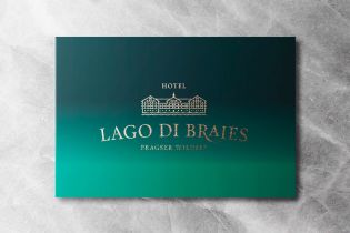
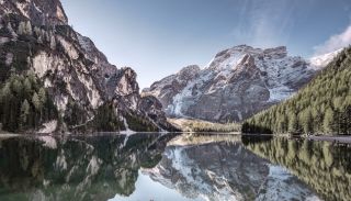
Braies Lake: going beyond the hype

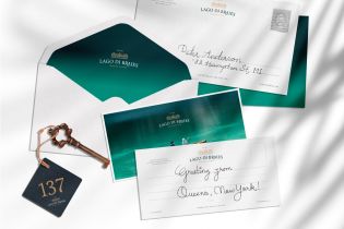
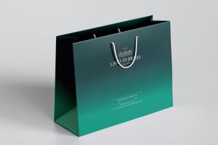
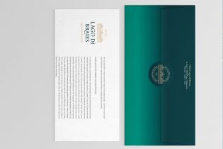
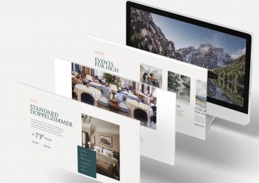
Hotel Lago di Braies is a historical building dating back to the end of the 19th century and, to this very day, contributes to the charm of these azure waters. The lake mirrors the Dolomites’ peaks, and its charm goes beyond the hype behind the location. The hotel aims to open up in a renewed shape: it wants to defend is glorious and historic past as well as proudly living in our modern day and age. We are working on this fascinating project by designing the new logo, developing the corporate identity and the hotel’s website, and by providing a clear strategy.

Over the last few years, Braies Lake has been on everyone’s lips. This notoriety has caused problems for the location’s identity. Hotel Lago di Braies wanted to preserve this evanescent authenticity and, therefore, felt the need to reposition the infrastructure, starting with its logo right through to its corporate identity. What we have done is rationalise the sign and all its applications by implementing a containment strategy to stop this relentless dispersal. We cleaned up and renewed everything with one aim: giving the right impuls(e) for the renewals which will be carried out during this year and the following ones.

Lago di Braies: Corporate Identity
The colours
Lago di Braies: Corporate Identity
The gradient
Lago di Braies: Corporate Identity
Typography
Lago di Braies: Corporate Identity
The applications

We are currently studying and developing the hotel’s new website, which will be launched next spring, during what we hope will be the start of a more sustainable and regular type of tourism on the shores of the lake.

Lago di Braies: Corporate Identity

Like how we work? Get in touch!

Puls(e) with us