

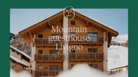
A name that reflects the essence
Initially, the Bonvivar project had a name that didn’t fully express the uniqueness and depth of the hospitality offered by the three sisters. The name "Bonvivar," which comes from the Livignasco dialect and literally means "to live well," was carefully chosen to reflect the philosophy that guides the hospitality of the establishment.
"Bonvivar" not only embodies the concept of living well, but also symbolises a deep connection with the territory. The use of the dialect emphasises the humility and simplicity of mountain life and its people. More than just a name, Bonvivar is a desire, a lifestyle, and a mood that embodies the possibility of experiencing the mountains in an authentic and fulfilling way.
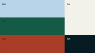


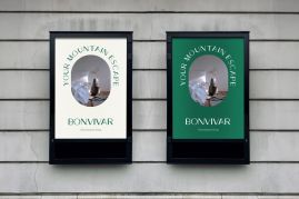
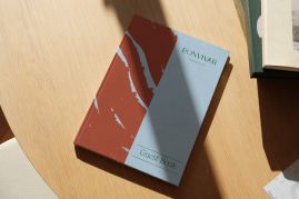
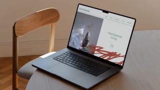
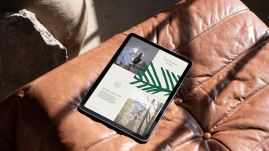
Bonvivar's visual identity between vibrancy and territory
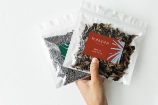
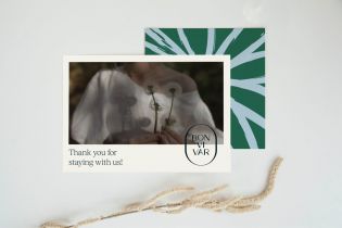
Bonvivar's visual identity celebrates modernity and authenticity. Each visual element tells the story of Bonvivar and its deep connection to the territory, reinterpreted in a contemporary way.
The custom-designed logotype font gives the brand uniqueness, while the vibrant color palette reflects the hues of the surrounding nature. The textures, developed to reflect the distinctive elements of the area, add depth and character to the visual identity. The typography, an elegant blend of sophistication and modernity, plays a crucial role in the visual communication.
This approach also extends to the web design as well, ensuring a refined and sensitive navigation that complements the visual experience of the brand.
Like how we work? Get in touch!
Puls(e) with us